In Web Development, we often think about design, performance, tools, and libraries when building our applications, but when it comes to usability and user experience making these applications more accessible is also an important task that is not always common to see on a daily basis.
Essentially, web accessibility is about creating and managing content on the web that can be not only functional but available, understandable, and operable by anyone.
Jump to heading A11y and Standards
“A11y” is a numeronym of the word “accessibility”. Numeronyms are abbreviations that use numbers to abbreviate by taking the first and last letters (“a” and “y” in this case). It is a common term to refer to Web Accessibility.
Jump to heading Web Content Accessibility Guidelines
The Web Content Accessibility Guidelines or WCAG is a set of practices and guidelines to help you make web content more accessible to people with disabilities.
These guidelines are group in four principles:
- Perceivable: Users must be able to perceive the information being presented in more than one sense.
- Operable: Users must be able to operate the interface, in other words, the interactive elements of your website should be controllable by the user.
- Understandable: Users must be able to understand the information as well as the operation of the interface.
- Robust: Users must be able to consume the same web content by different browsers and assistive technologies.
WebAIM is a sort of short version or summary of the WCAG guidelines as a checklist to help identify what you need to implement.
The best way to follow these guidelines and accomplish these criteria is to take a look at the WAI-ARIA Best Practices document to know which attributes do you have to set on your custom element and what type of keyboard support it needs to provide.
Jump to heading Focus
Many websites nowadays are primarily visual in their nature and for that reason, they tend to lack keyboard navigation, which is a essential tool for users with visual or motor impairments.
In short, when we say focus, we refer to the control of the interactive elements on a page that receives input from the keyboard, for example, a text field or a dropdown. Keyboard Navigation can be done either by pressing Tab (to move forward), Shift + Tab (to go backward), or arrow keys.
Jump to heading Handling Focus
The order in which elements receive the next or previous focus is called the tab order. The tab order is based on the DOM structure of your page.
Native controls such as inputs, buttons, and selects are implicitly focusable which means they’re automatically inserted in the tab order.
But if you’re building a custom component/element you would have to add your own keyboard support. You can manipulate which elements receive focus using the tabindex attribute.
tabindex="0" means that the element will be on his natural tab order based on its position in the DOM.
<div tabindex="0">Press Tab!</div>
Usually, only interactive elements can be focusable, so there’s no need to put the focus on a div, image, or paragraph if the user cannot interact with it.
tabindex="-1" means that the element will not be on the tab order but can still be focused via mouse or programmatically via JavaScript using the focus() method.
<nav class="offscreen sidenav" tabindex="-1"></nav>
tabindex="1" or (anything greater than zero) means that the element will jump on the tab order, but this often leads to confusion and it’s also considered an anti-pattern.
Ideally, if you want to move something on the tab order, you should move it on the DOM whenever is possible.
Adopting keyboard-navigation techniques brings a lot of benefits for users with motor impairment and also for typical users that are keyboard-focused, as they would be more productive.
Jump to heading Accessible Images
You probably might know this already, but we can provide an alternative text so users and search engines can understand what the image is about. It also used to display the text whenever the image is not available.

<img alt="The Colosseum in Rome" ... />
It can be a simple or a more elaborate description:
<img alt="The Colosseum building under gray sky during daytime" ... />
Choosing the appropriate alternative text can be tricky though, it’s all about context. Some images may be decorative and others more functional, to get a deeper understanding I highly recommend checking out this amazing article by WebAIM
Jump to heading Semantics
A screen reader is one of the most popular assistive technology that can help users with visual disabilities to operate a computer by reading content out loud with a generated voice. Many operating systems today have their own Screen Reader solution, for instance, macOS has VoiceOver and Windows has the Narrator app.
But before the web content can be turned into audio, the assistive technology uses the Accessibility Tree representation to retrieve enough information about its content.
Broadly speaking, the Accessibility Tree is a non-visual DOM tree representation modified by the browser to use all of the semantic information available on the page in a way that can be useful to assistive technologies. For example:
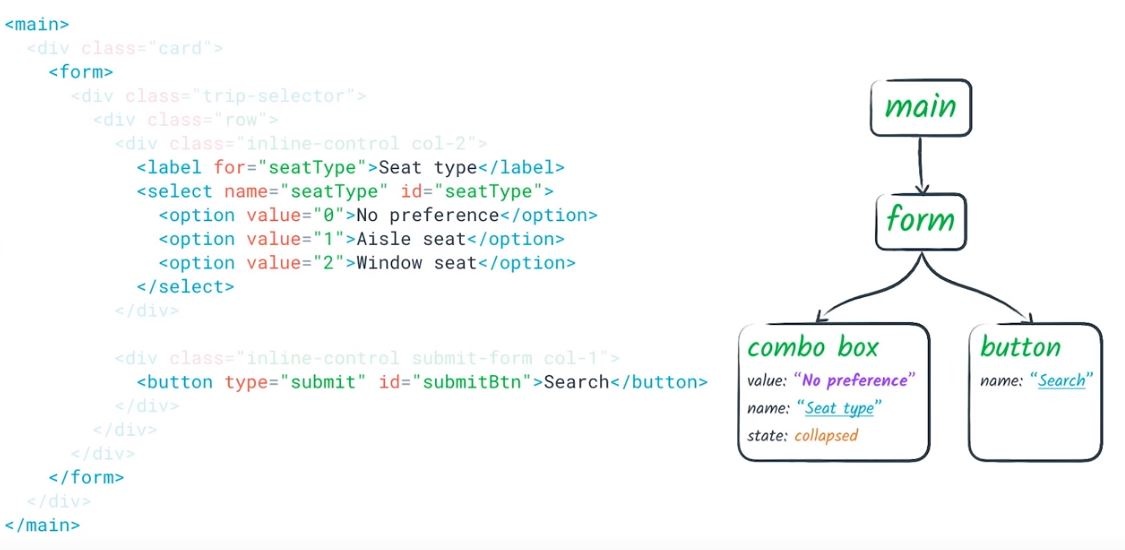
Browsers, such as chrome, can display the accessibility tree like this:
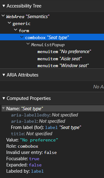
Therefore, writing good and semantic HTML elements has a huge impact on how this content will be presented to our end users.
In fact, native elements have implicit semantics that can be recognized by the browser.
<!--
	these are called "landmarks", certain regions on the page the user may want to have a quick access
through assistive tech.
-->
<header>
  <nav></nav>
</header>
<main>
  <section></section>
  <article></article>
</main>
<aside></aside>
<footer></footer>
But if you start writing your own component you would have to use the correct attributes in order to express and translate these semantics into the accessibility tree and this where WAI-ARIA comes in.
Jump to heading WAI-ARIA
WAI-ARIA stands for Web Accessibility Initiative Accessible Rich Internet Applications, it enables us to include additional semantics to our HTML elements using aria-* attributes. It works by specifying special attributes that can modify the way the element’s content is being translated into the accessibility tree.
Note: ARIA only changes the accessibility tree, it does not add/remove any sort of visual or behavior.
Jump to heading Labels
We can take advantage of certain aria attributes to make our elements more discoverable by assistive technologies.
aria-label can specify a string to be used as the accessible name or label, this is especially useful when you have an element that has no text content inside of it.
<button aria-label="Close" class="close-button">
  <svg></svg>
</button>
aria-labelledby is pretty similar to using an <label> element, it works by specifying an ID of another element we will use as our label.
<h1 id="section-1-title">Cool Headline</h1>

...

<section aria-labelledby="section-1-title">Some text...</section>

<!-- It can also take multiple id's to compose a label from multiple elements -->
<button
  class="button"
  id="download-btn"
  aria-labelledby="download-btn download-details"
>
  Download
  <!-- this will announced as "Download JPG, 450 kb button" -->
</button>
<p id="download-details">JPG, 450 KB</p>
aria-describedby similar to aria-labelledby. It can reference elements, which might no be visible every time, to provide an additional description the user may need in order to complete its action.
<input
  type="password"
  name="password"
  id="password"
  aria-describedby="password-help"
/>
<small id="password-help">Password must be at least 8 characters</small>
But be careful when using any of these attributes! Since assistive technologies use the Accessibility tree, ARIA can override those built-in semantics and lead your application to incomprehensible results.
Jump to heading Roles and Controls
ARIA can also express semantic relationships between elements, even when you do not have a direct parent-child relation or vice versa.
For instance, you might have a button that controls whether or not a menu is visible:
<!-- aria-controls identifies the element (or elements) content are controlled by the current element-->

<button class="button" aria-controls="menu-items" aria-haspopup="true" id="menu-button">
  <span>Account</span>
  <svg xmlns="http://www.w3.org/2000/svg" fill="none" viewBox="0 0 24 24" stroke="currentColor">
    <path stroke-linecap="round" stroke-linejoin="round" stroke-width="2" d="M16 7a4 4 0 11-8 0 4 4 0 018 0zM12 14a7 7 0 00-7 7h14a7 7 0 00-7-7z" />
  </svg>
</button>
<div class="dropdown" id="menu-items" role="menu" tabindex="0">
  <ul class="dropdown-menu">
    <li class="dropdown-group">
      <li class="dropdown-menu__item"><a href="/profile">Your profile</a></li>
      <li class="dropdown-menu__item"><a href="/help">Help</a></li>
      <li class="dropdown-menu__item"><a href="/settings">Settings</a></li>
    </li>
    <li class="dropdown-group">
      <li class="dropdown-menu__item"><a href="/logout">Logout</a></li>
    </li>
  </ul>
</div>
You might notice the dropdown has a role. You can think of a role as a type of component you’re building. Each role can support states and properties, such as checked, pressed, hidden, and so on.
And you can also declare a relationship between siblings elements using aria-owns, but in this case, we’re indicating that an element (child) depends on another element (parent) regardless of how the DOM hierarchy is set.
<div role="menu" class="menu" id="menu" aria-owns="submenu">
  <ul>
    <li>News</li>
    <li>Science</li>
    <li>Sports</li>
    <li>Languages</li>
  </ul>
</div>
<div id="submenu">
  <ul>
    <li>English</li>
    <li>Deutsch</li>
    <li>Español</li>
    <li>Portuguese</li>
  </ul>
</div>
Jump to heading States
Sometimes you might have elements that are more often likely to have different states due to user interaction or some external factor. In these cases, ARIA provides a handful of states and properties that can express this current behavior to our users.
Usually, if we need to hide some content on a page we add visibility:hidden or display:none property, But if those elements are not visually hidden, like offscreen content, you can set aria-hidden="true" to explicitly hide or not expose from assistive technologies.
ARIA also provides us a way to define real-time content. aria-live is used to indicate a region of your page that is constantly changing due or not to user interaction, such as a popup message, status, or live chat.
It can accept two values: assertive or polite which define the priority of how these live updates would be announced.
<!-- assertive means it will be announced immediately -->
<div role="alert" class="alert danger" aria-live="assertive">Urgent!</div>

<!-- polite means it will announce only if the user is idle -->
<div class="status" aria-live="polite">Your configuration is not complete</div>
There are several of these attributes, you can check the full list here.
Jump to heading Color Contrast
Choosing the right colors for our projects is always challenging, and so is contrast. In fact, Color Contrast is one of the most common accessibility issues that can be found on websites nowadays, mostly due to people not being able to understand how to match the correct color contrast ratio.
The contrast ratio is a property calculated by the difference between the luminance of the foreground color and the luminance of the background color. Whereas the closer these two colors are, the lower is the contrast ratio. This is ratio can range from 1:1 (white text on white background) to 21:1 (black text on white background).
In order to make your content more perceivable and with the correct contrast ratio you have to meet one of the following criteria:
- Level AA (Minimum) — Large text (≥ 24px or ≥ 18px if bold) must have a contrast ratio of at least 3:1, and body text a contrast ratio of at least 4.5:1
- Level AAA (Enhanced) — Large text or images of large text must have a contrast ratio of at least 4.5:1, and body text a contrast ratio of at least 7:1
Although it is not explicitly mentioned in the specification, if your text can change color on different states, like on hover, on focus or when pressed you might as well assume it would have to meet the same requirements as well.
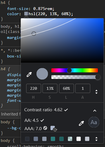
If you are on Chrome (or any chromium based browser) you can inspect a text element on the page and you will see a popup showing the current contrast value and what criterias it is matching or not.
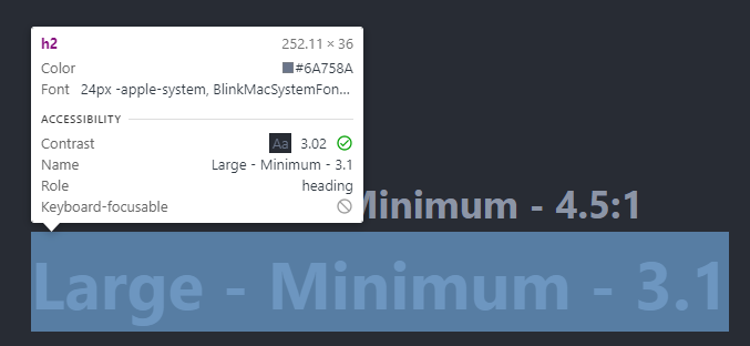
In addition, if you open the styles tab on the dev tools, select the text element and click on the color property, you will see a visual picker popping up with the contrast ratio information, and you can also change the color by picking in any area between these two slightly curved lines.
Jump to heading How to measure web accessibility
Finally, there are many ways we can evaluate if our application is accessible or not. Accessibility tools can help you to quickly identify which areas of your site need more work.
Some of these tools are:
- Browsers features and extensions:
- Lighthouse
- axe
- WAVE
- Accessibility Insights for Web
- Libraries and frameworks:
It is important to note that none of these automated tools can fully guarantee our application is indeed more accessible because at the end of the day you will be developing in favor of human facility and usability, so manual evaluation is also a good option to ensure that our changes have improved the final experience.